Logodesign
Ascension Sales, LLC
Logo Design Process and Walkthrough for Ascension Sales, LLC. Project was to create a new logo for a real client, Ascension Sales, LLC. Here's my design process and a walkthrough of how the final logo was created.
Ascension Sales, LLC are sales company for all thing created by Black Diamond. The new logo needs to work alongside the Black Diamond logo, but may also be used if Black Diamond acquires other companies or brands.
The first meeting was a friendly, get-to-know you meeting with Jacquelyn Cox and Brian Stevenson from Ascension Sales, LLC. They presented samples of products they sell for Black Diamond to the class, and discussed aspects of the company, what they were thinking for a logo and walked through the mood sheet. They had a few aspects they wanted, such as full name "Ascension Sales, LLC ". Otherwise, there was creative freedom surrounding the design – which is always nice.
After conducting a little research, I started sketching Ideas I felt represented the information I had gathered from the initial meeting and research. I created about 30 rough sketches, ranging from a very corporate feel to a grunge feel. I took those sketches and created about 80 computer roughs.
The second meeting was just with Jacquelyn Cox. The class displayed our sketches on the back wall and critiqued our work. We discussed the sketches to make sure we were working in the right direction and were seeing eye-to-eye on the design. Also, I met personally with Ellen Long, my professor, to get more feedback on the designs. We narrowed the sketches down to nine designs we found represented the different aspects of Ascension Sales, LLC.
The nine logo sketches were then drawn up in Adobe Illustrator, Corel Draw and Adobe Photoshop. I did some more research for color and identity ideas. The logo was then developed into black and white, color, and a few secondary variations such as being reversed out of a dark background, and reproduced using a single color for use in specific circumstances. The idea for the color of the logos was to take inspiration from Black Diamond's website; color-wise, Pantone 181, Pantone 2768, Pantone 7496, Pantone 420 and Pantone Black are appropriate choices for Ascension Sales, LLC. The logo graphic, color and type were then combined; the flowing line of the graphic seemed to fit quite well into the natural shape of the text layout.
I also created samples of: letterhead, business card, envelope, and a sample of ideas for leave-behinds with their logo on them. Then I created one leave-behind for both Jacquelyn Cox and Brian Stevenson to give them in the next meeting: a twig pencil with their logo printed on heavy cardboard attached with twine for an outdoorsy feel.
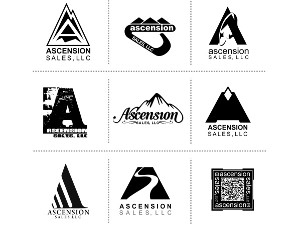
The third meeting was with both Jacquelyn Cox and Brian Stevenson. The class displayed our computer-generated ideas on the wall. These designs were first shown in black and white so we could focus on the balance, feel and strength. After a few of my concepts were chosen, I presented the color versions with the sample materials. We had a peer discussion and critique of the concepts. Three logos were chosen to bring to final design.
The final three logos were then polished for the final presentation. I mounted samples of the work on black boards, created the assignment book and created cds for both client and teacher.
Overall a highly enjoyable project, it has been a pleasure working with Jacquelyn Cox and Brian Stevenson and I'm looking forward to seeing the mark they chose, the development of that mark. And I hope they will use me as a resource in the future.
Software used:
- Adobe Photoshop
- Adobe Illustrator
- Coreldraw
-
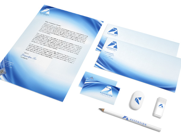
The finished - sample of logo idea and stationary
-
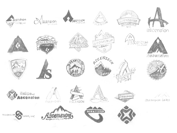
The start - sketches in my sketchbook
-
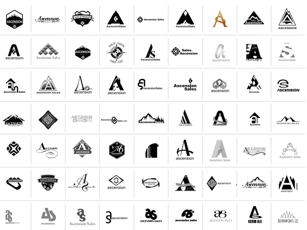
Next - computer sketches
-
Nine - The top nine designs to choose from
-
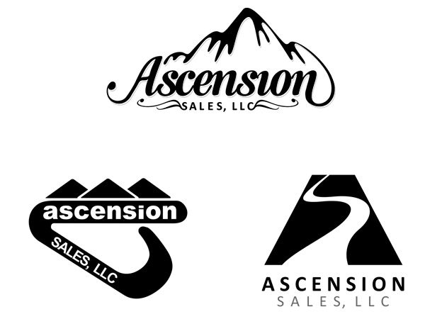
Three - These are the three the client choose to go to the next step
-
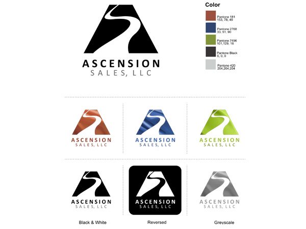
The Choosen one - The final logo design with color palette
-
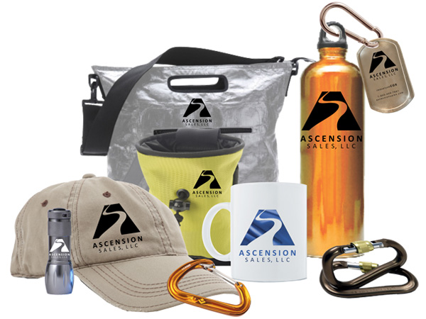
Ideas of product for leave behinds
About me
I provide original, quality, attractive and functional design.
Address: P.O. Box 40415, Denver Colorado 80204
Telephone: 720-280-5130