Logodesign
Miles Petrock
Logo Design Process and Walkthrough for Miles Henry Petrock
Project was to create a new logo design for Miles Henry Petrock. Here's my design process and a walkthrough of how the final logo was created.
Miles Henry Petrock is an Art Institute of Colorado student majoring in Audio and Visual Effects with a strong emphasis on Audio Effects. The new logo needs to focus on the Audio Effects.
After a friendly, get-to-know-you meeting with Miles and working through a Mood Sheet, we fleshed out some thoughts on the style of the logo and what values would be presented through it. Miles mentioned it would be ideal if we used a sans-serif font, and the logo had a graphic element along with the Miles Henry Petrock wording. Otherwise, there was creative freedom surrounding the design – which is always nice.
I started by sketching out my ideas for the logo. My main focus for the graphic of the logo was to display the letters M, H and P in a creative way that could be seen as an abstract mark, but also recognizable as the letters under closer inspection.
After conducting a little research, it occurred to me that the sound wave, speaker and headphones are widely recognized symbols of audio, so I concentrated on drawing up logos representing those images. The three styles that stood out were the ones that used one of these symbols along with a shortened version of his name, all of which represented the same message but in different visual styles.
At our second meeting, Miles and I discussed the three pages of sketches to make sure I was working in the right direction and we were seeing eye-to-eye on the design. We narrowed the sketches down to three designs we both found represented Miles.
The three logo sketches were then drawn up in Adobe Illustrator, Corel Draw and Adobe Photoshop and experiments were conducted on the appropriate type styles. We chose Carpenter ICG and Arial Rounded MT Bold. They have a nice relationship to each other and would work great both in print and on the web.
During the third meeting we went over the three computer-generated designs. These designs were shown in black and white so we could focus on the balance, feel and strength. A concept was chosen with a small modification. We had a peer discussion and critique of the concepts. The group validated our decision about the logo and that it conveyed the message and emotion of our initial meeting.
After the revision of the logo color was added. The idea for the color of the logo was to take inspiration from the world; I had Miles send me a sample of all the colors he felt represented him, his career path and his style. Color-wise, Pantone 450, similar to olive green, was an appropriate choice because it represents life, balance and growth in color theory.
The logo graphic, color and type were then combined; the flowing line of the graphic seemed to fit quite well into the natural shape of the text layout. The final logo was then developed into a few secondary variations such as being reversed out of a dark background, and using a single color. This rendered the project complete: the logo files were zipped up and sent over by email.
Overall, a highly enjoyable project; it has been a pleasure working with Miles and I'm looking forward to seeing the development of his mark.
Software used:
- Adobe Photoshop
- Adobe Illustrator
- Coreldraw
-
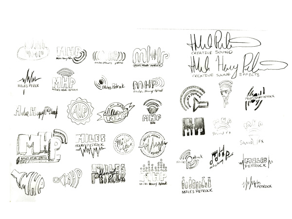
The start - sketches in my sketchbook
-
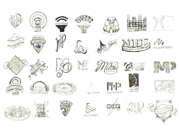
The start - sketches in my sketchbook
-
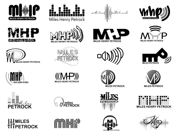
Next - computer sketches
-
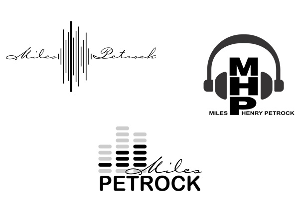
Three - These are the three the client choose to go to the next step
-
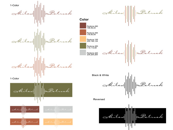
The Choosen one - The final logo design with color palette
About me
I provide original, quality, attractive and functional design.
Address: P.O. Box 40415, Denver Colorado 80204
Telephone: 720-280-5130